
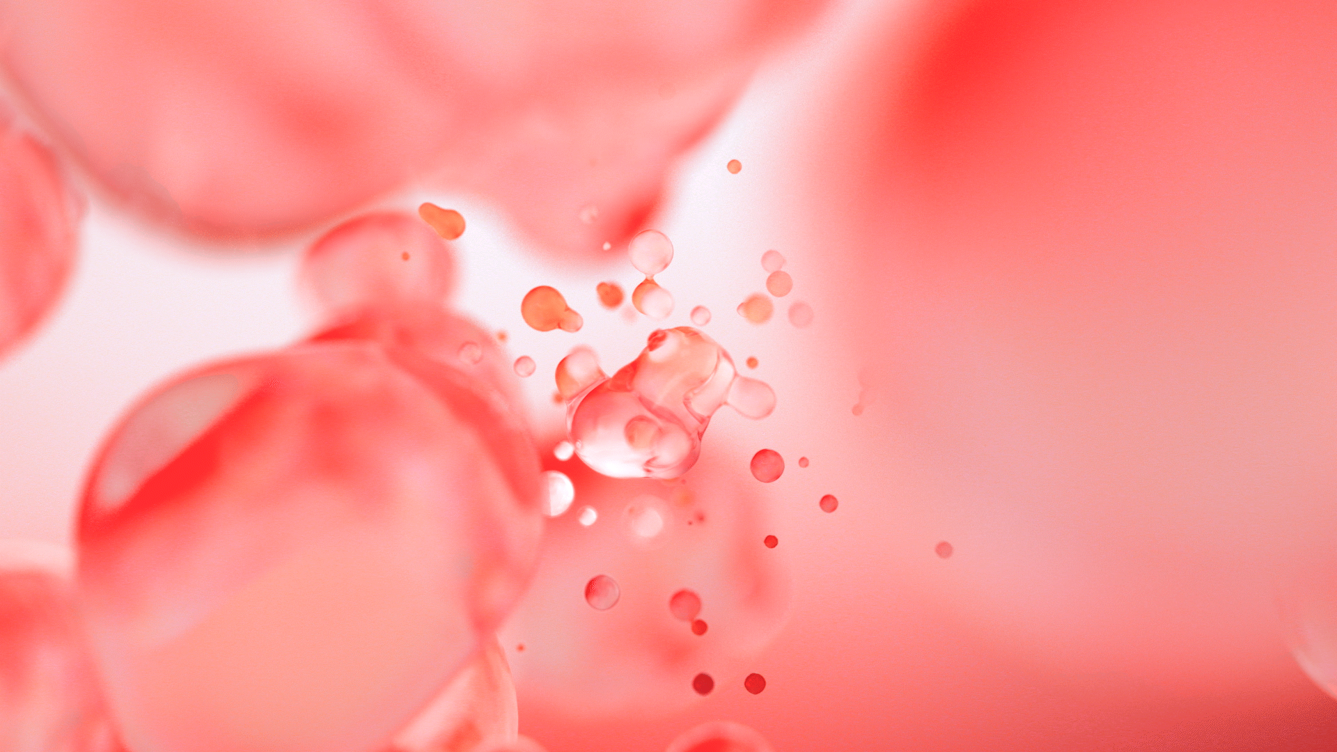
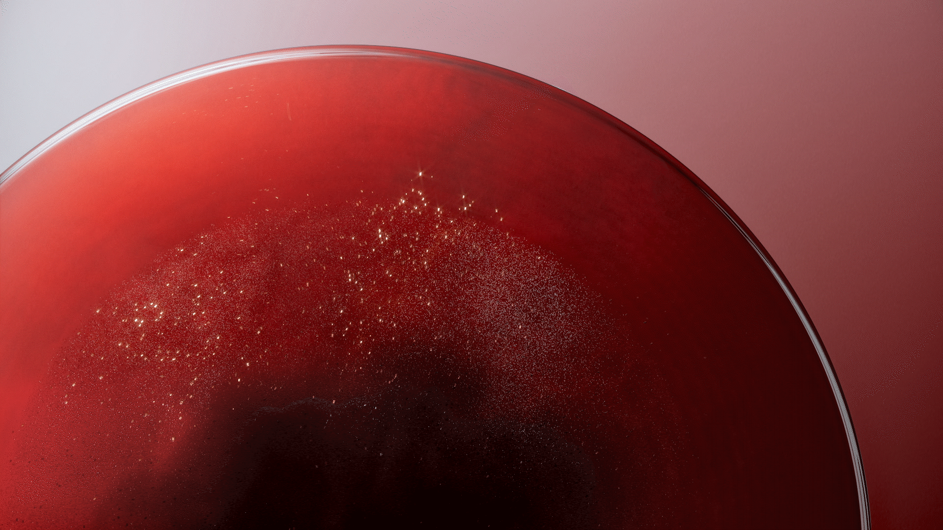
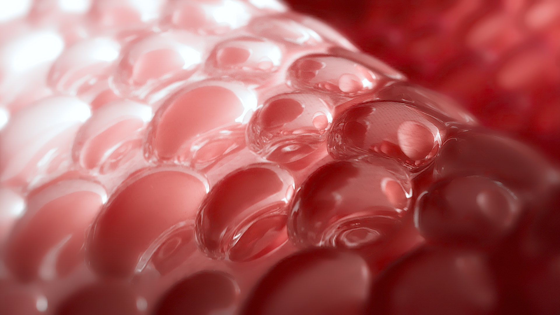
我們為京城之霜製作了TVC,因為影片時間較短,因此我們讓影片只講一個重點,就是水份,直接且清楚的讓觀眾感受到京城之霜能帶給他們的東西。 以水珠的意象貫穿整部影片,水珠代表著京城之霜的成分及精華,也代表著皮膚內部的水份,有保濕、讓皮膚緊實及彈性的意象
-
We have created a TV commercial for the skincare products under the NARUKO brand. Due to the limited duration of the video, we have chosen to focus on a single key aspect: water. The video briefly conveys the benefits that skincare products can provide the audience.
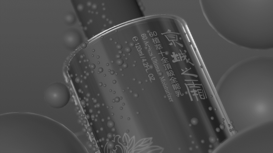
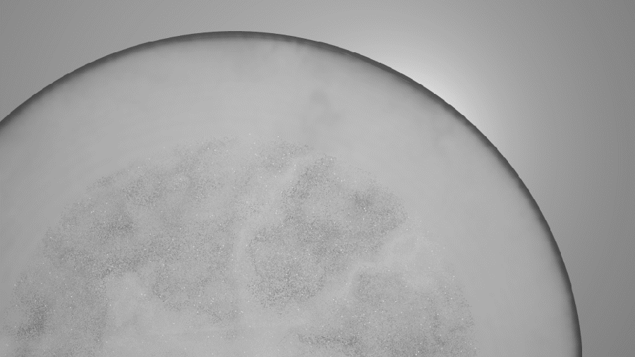
The imagery of water runs throughout the entire video, symbolizing the ingredients and essence of the skincare products. Also represents the skin's internal moisture, signifying hydration, skin firmness, and elasticity.
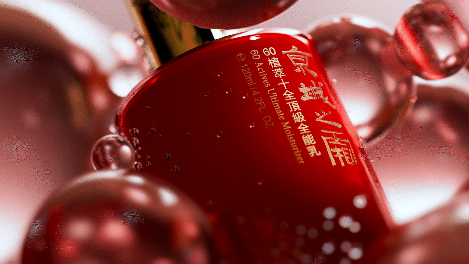
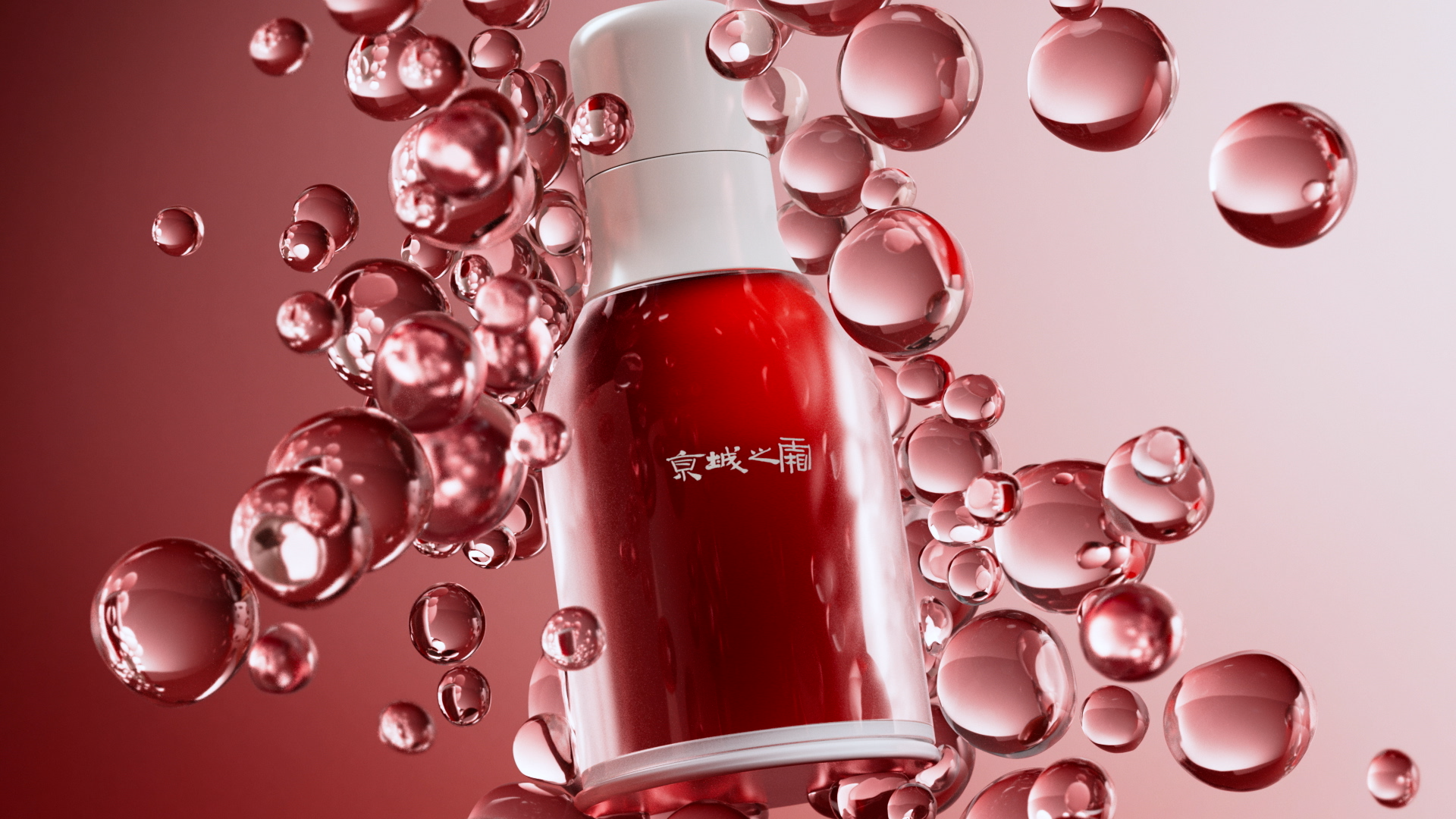
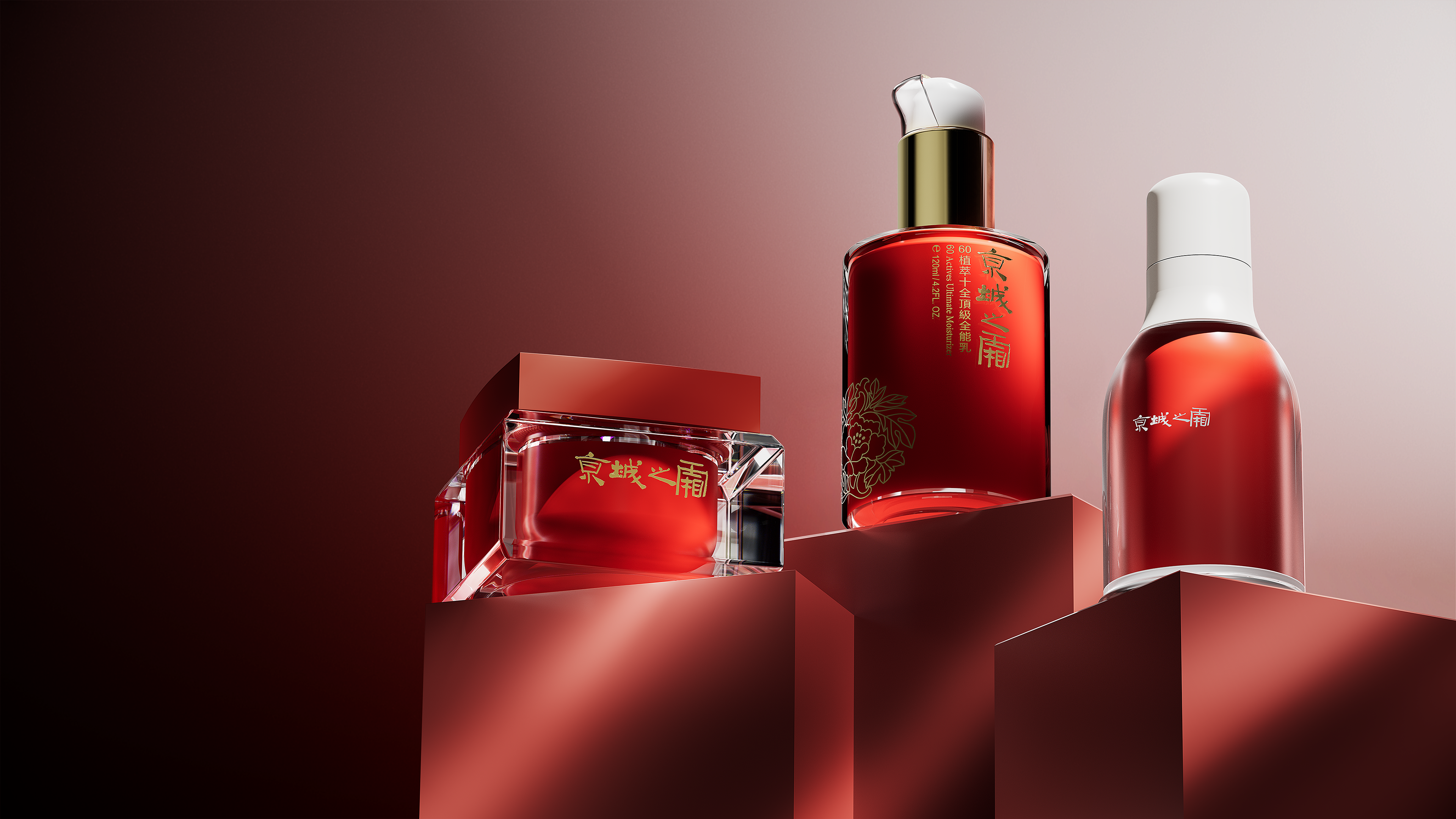
At present, competitors in the market predominantly utilize visual elements in shades of gold and blue. Opting for a bold combination of red and white not only allows us to stand out from the market but also strikes a balance between fashion and product color coordination. This daring color scheme not only sets us apart but also enhances the overall visual coherence and harmony with the product, creating a stronger and more resonant visual identity.
Motion Design & Styleframe


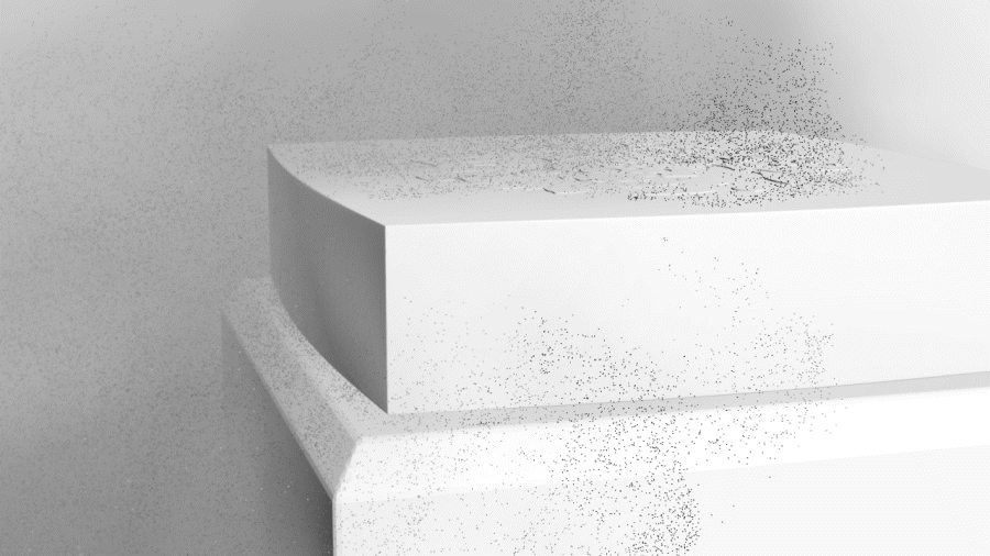
Particle Simulation
Client | 牛爾NARUKO
Produced by MULTI
Director | Kai
Project Manager | Ling
3D Artist | Gene Jiang
VFX|Albert Chiang, Gene Jiang
Compositor | Gene Jiang, Ling
Music & VO|蔡秉衡
Produced by MULTI
Director | Kai
Project Manager | Ling
3D Artist | Gene Jiang
VFX|Albert Chiang, Gene Jiang
Compositor | Gene Jiang, Ling
Music & VO|蔡秉衡